Devex
Frontend developer / Product designer
Devex is a leading platform for the international development community, offering news, insights, and career opportunities for professionals in the development and humanitarian sectors. When I first joined the Devex team, I started as a frontend developer. As my role evolved, I was entrusted with the entire design process. I redesigned most sections of the Devex platform, including the homepage. This comprehensive redesign enhanced the site's usability and visual appeal.
The challenge
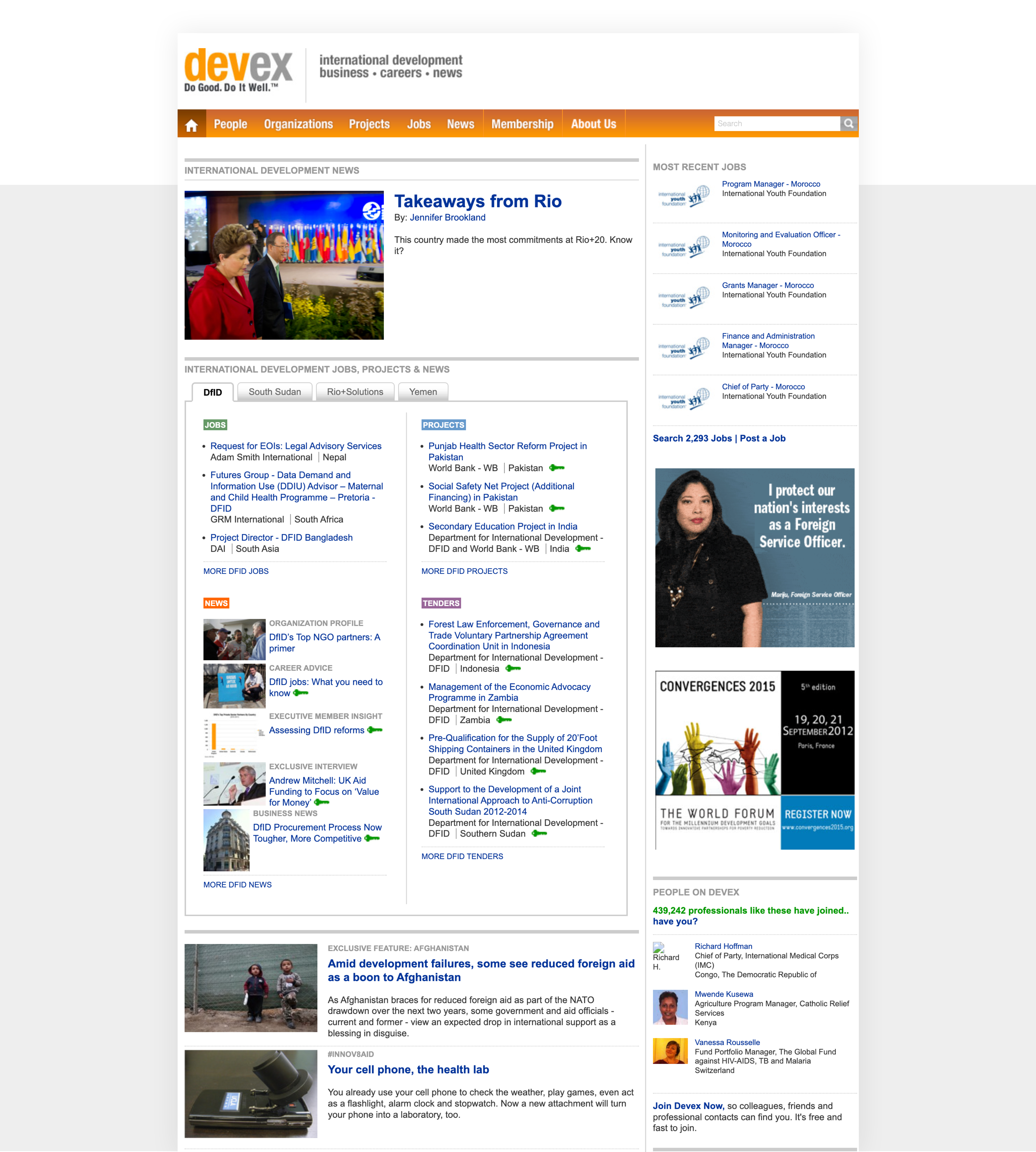
When I join Devex, it quickly became apparent that, despite being a important source of information for professionals in global development, the platform struggled with a user interface that felt overwhelming and unintuitive. Visually busy and lacking in clear functionality, the interface presented a significant challenge.
Other issue was that there was no user insights or UX research to guide improvements. I found myself navigating blind, with no data to understand our customers' experiences. Moreover, I was initially brought on as a Frontend developer, but it was my passion for UX that drive me to recognize and confront these significant challenges.
The process
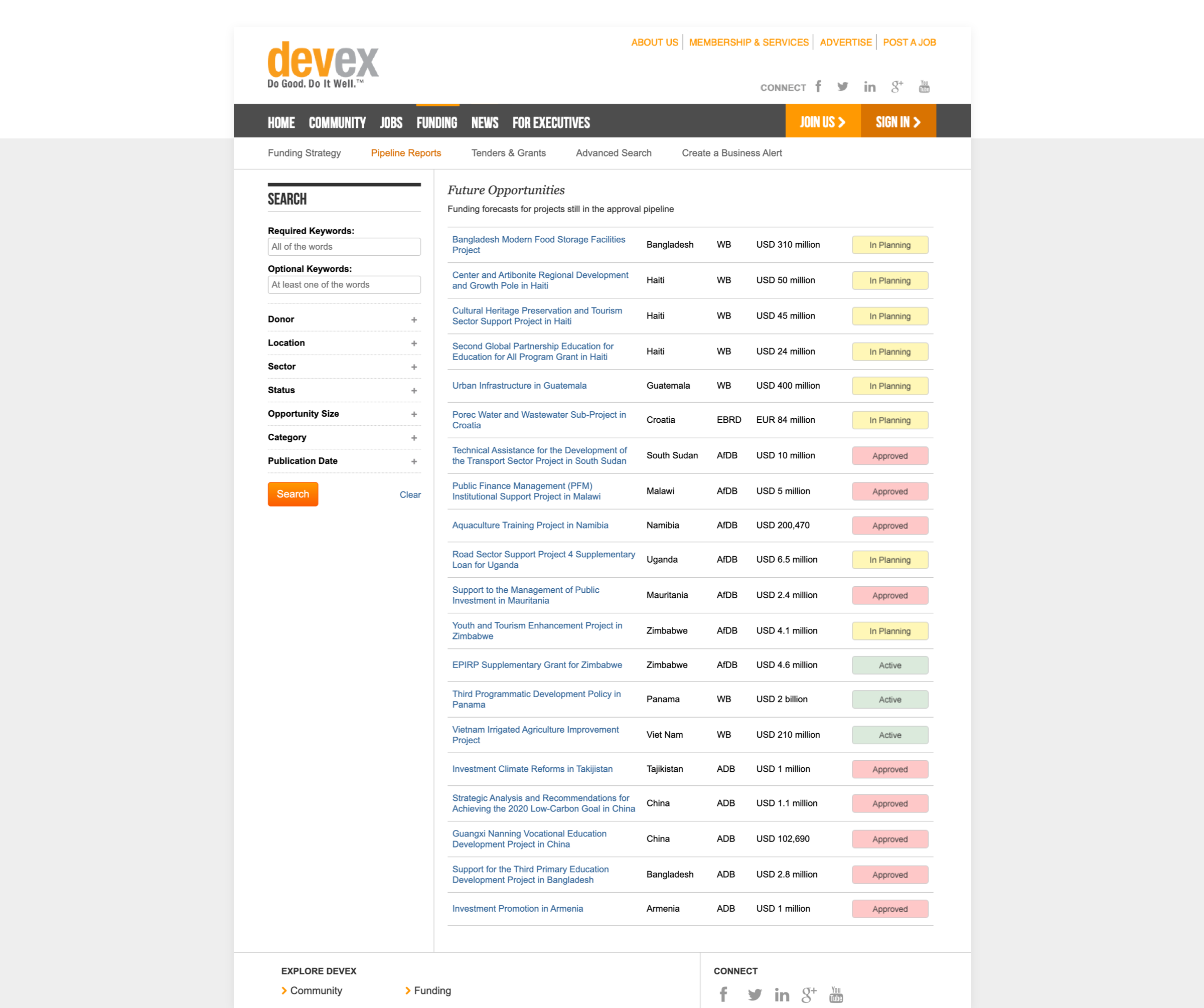
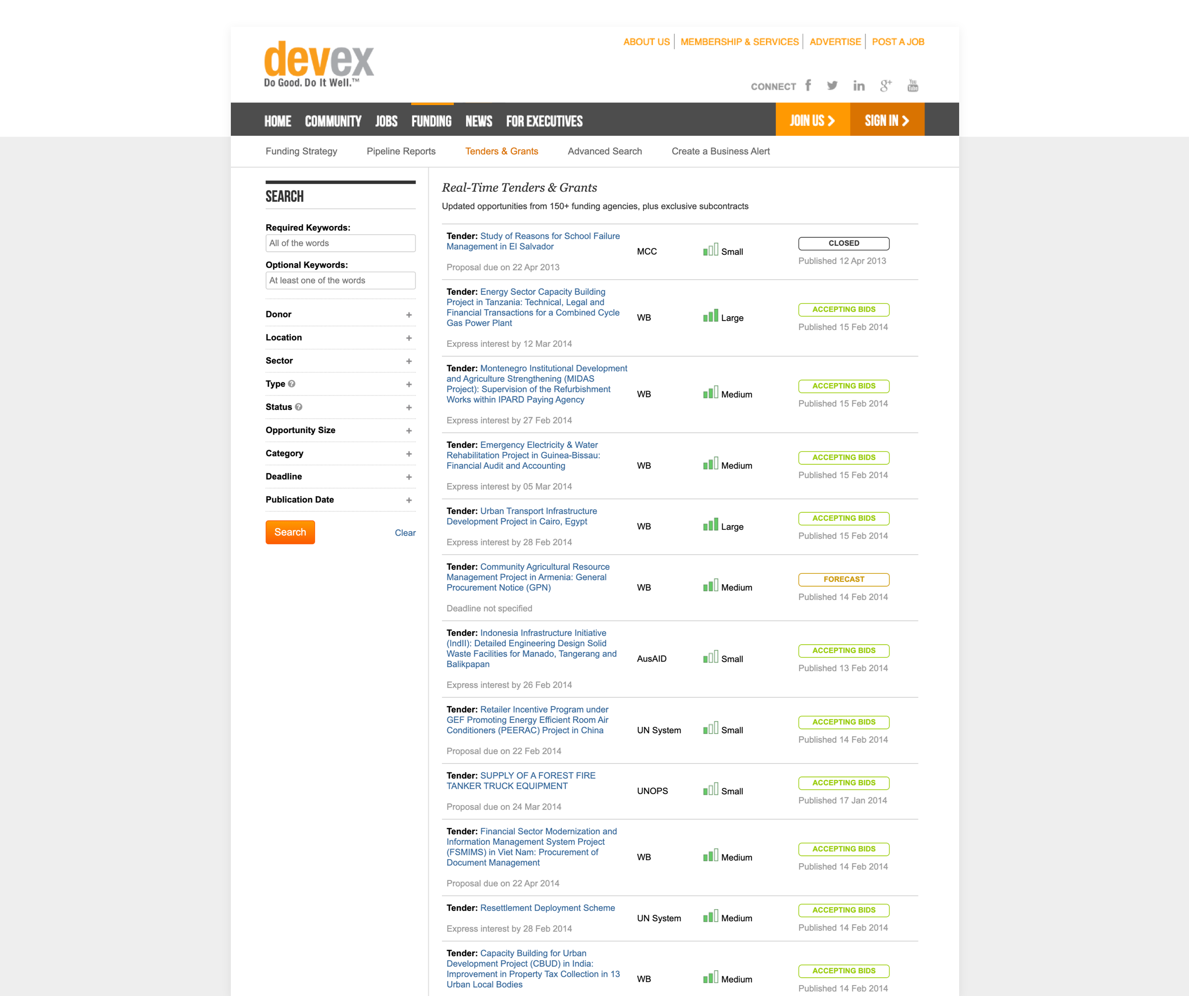
In addition to the existing challenges, I found multiple teams and departments at Devex that wanted prominent visibility on the platform.
With no user data at hand, I decided to start from the inside out. My goal was to align the platform’s design with the company’s vision for user flows and prioritize touchpoints crucial for our business, particularly those driving revenue.
Conceptualization
The process began with the simplest of tools: paper and pen.
This method allowed me to freely experiment with various layouts and information hierarchies. A key part of this exercise was conducting extensive interviews with various stakeholders. Each conversation was a chance to learn more about their products and departments, helping me to identify the key elements for an effective presentation.
However, this process was not just about creating; it was also about refining and negotiating. It involved ongoing back-and-forth discussions with stakeholders, with each round of feedback leading to improvements and adjustments in how the content was presented. These steps were vital, as they gradually shaped a more defined version of the platform.
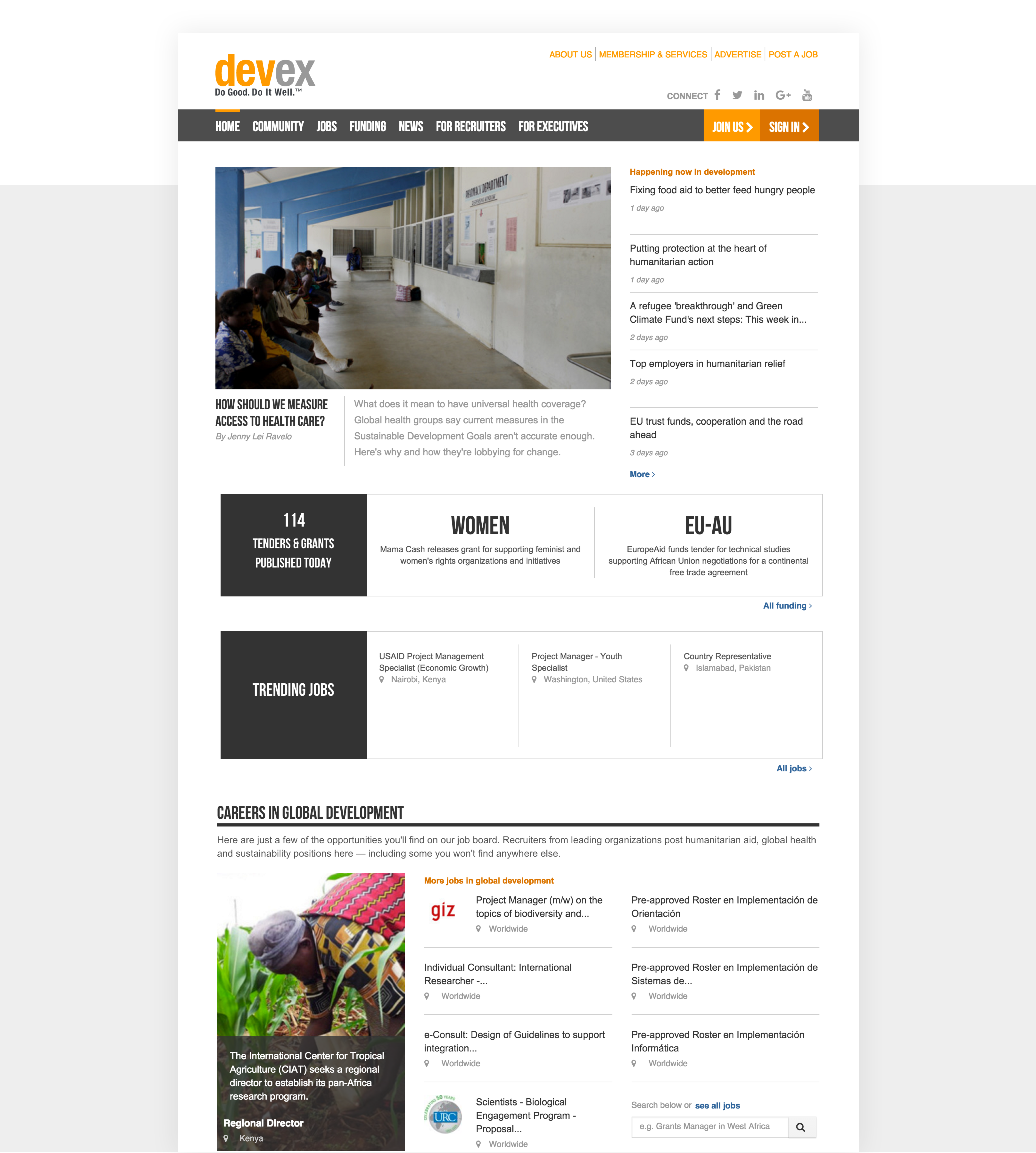
The result of such experimentation and collaboration was significant.
We introduced new sections that better matched the collective input and removed those that no longer aligned with our evolving vision.
This comprehensive approach was crucial in transforming Devex into a more streamlined and user-centric platform.
Refinement
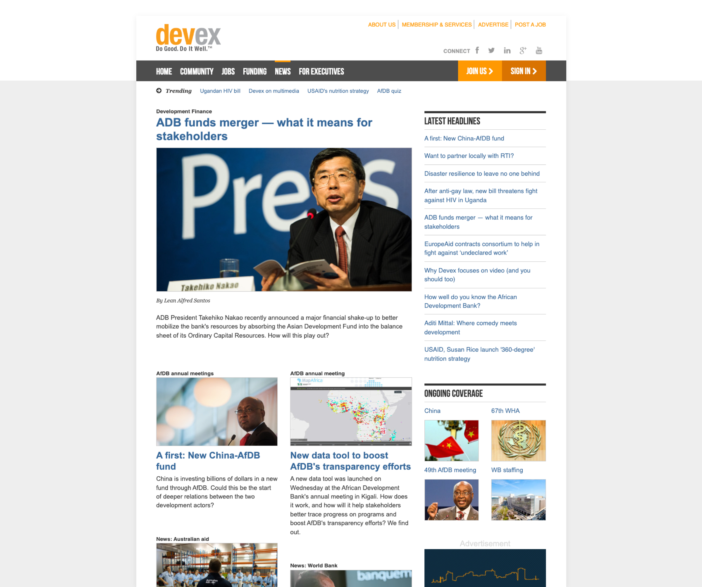
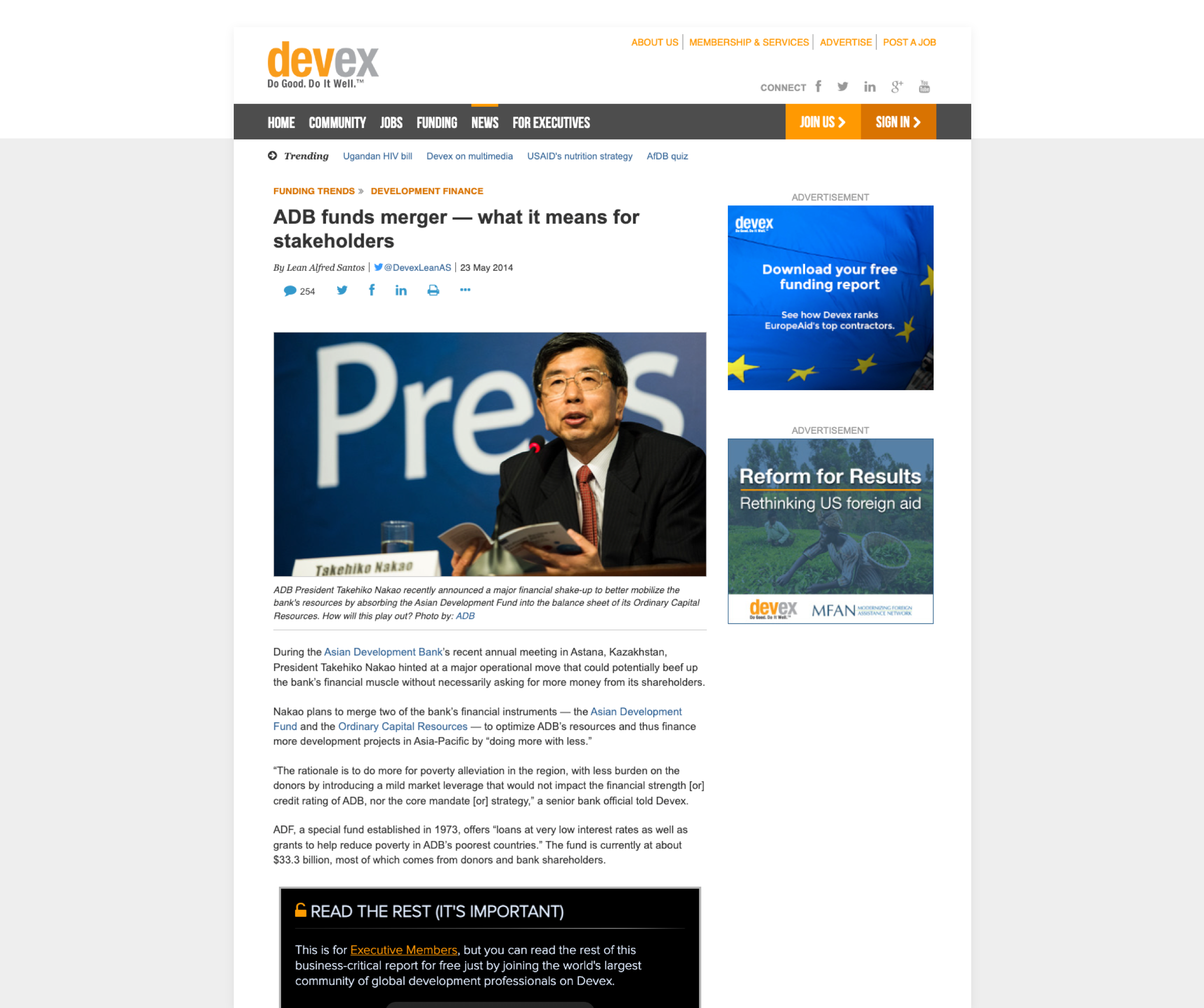
After the conceptualization, my focus shifted to refining the platform's visual and aesthetic elements. Initially, I found many gradients and a variety of colors that were taking away from the platform's main goal of delivering important information. Understanding the importance of clear and purposeful design, I decided to remove these unnecessary elements.
Understanding Devex's target audience was crucial in the visual redesign. Our users, including development professionals, NGOs, government agencies, and academic institutions, needed a platform where information is delivered clearly and is easily accessible. The simple and sober look I adopted reflected the seriousness of our audience.
The redesign also involved a strategic choice of typography. By selecting a font that was easier to read, we greatly enhanced the platform's usability. This practical change contributed significantly to the platform's overall functionality, making information not only more accessible but also more pleasant to engage.